What the pandemic looked like through the lens of Location Data


The pandemic has changed how we work, travel, learn, eat, shop, and even where we live. We’ve seen these changes manifest in ways big and small, from Covid case statistics to drive-thru lines. Human movement data gives us another lens to view the pandemic, as it has impacted the density of people in cities over time. Azira pulled data around the mobile device density for major cities in the United States to see what the pandemic looked like at different stages.
Azira’s Pulse Trend evaluates mobile device density over large areas and long periods of time in order to gain insight into which neighborhoods are experiencing an increase in activity and which are contracting. Because the overall supply of mobile data has increased over time, Pulse Trend represents an estimate of increases or decreases relative to that overall increase in data. Azira works with only high quality data from a wide variety of sources, and each of those sources come with their own data volume profiles over time, observations from each source must be combined to yield a final unified estimate.
Below is a look at the two largest DMAs in the U.S., New York City and Los Angeles, and the changes in density in those cities before the pandemic (2019), during early pandemic (2020), and in late pandemic / early recovery (2021).
New York City
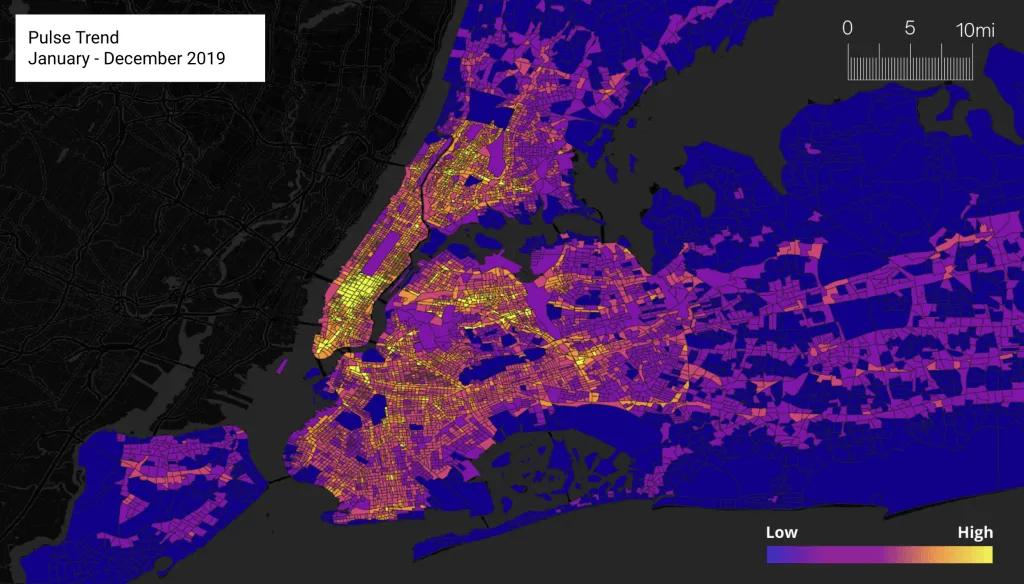
According to the 2020 U.S. Census, 8.8 million people live in the 5 boroughs of New York City, the most populous city in the U.S. While most of the city is densely populated, there were especially dense areas of growth pre-pandemic across much of Manhattan and parts of the Bronx, Queens and Brooklyn. Midtown and parts of Downtown Manhattan had the highest growth as shown by the yellow areas.
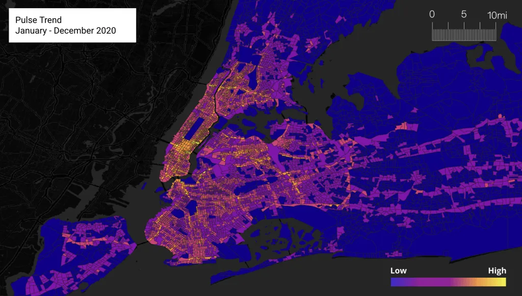
In 2020, the whole city decreased in device activity, with a 39% drop in density index. Midtown and Downtown Manhattan saw the sharpest decline in activity as they have a high concentration of office buildings that normally draw commuters from New Jersey, Long Island, upstate New York, and across the city itself.
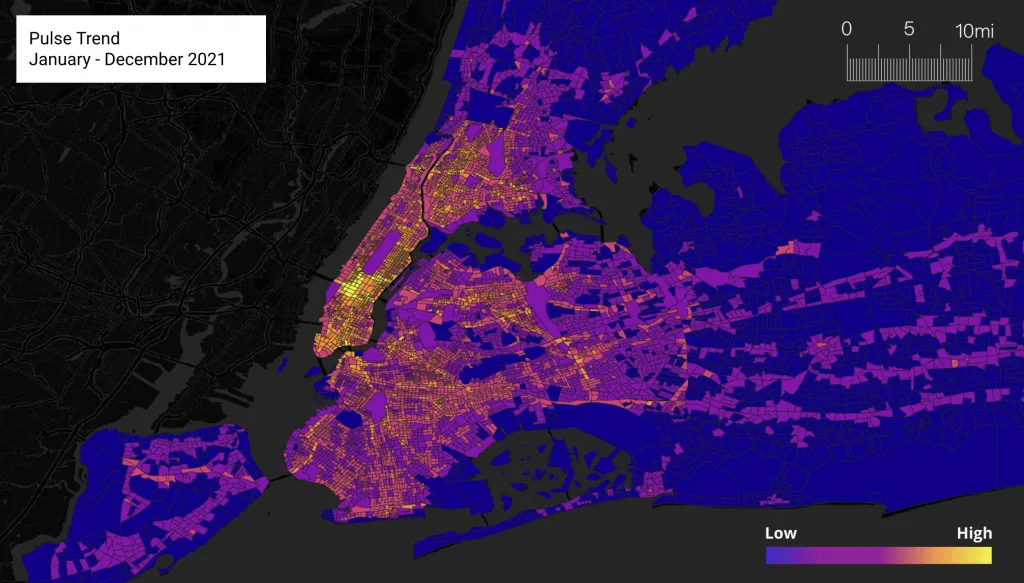
2021 shows the city starting to recover, with a 15% increase in density index from 2020. However, the growth in the city is at a much slower level than pre-pandemic. The area with the highest growth in activity in 2021 was around Midtown West including Times Square, an early sign of a recovery in tourism to the city.
Southern California
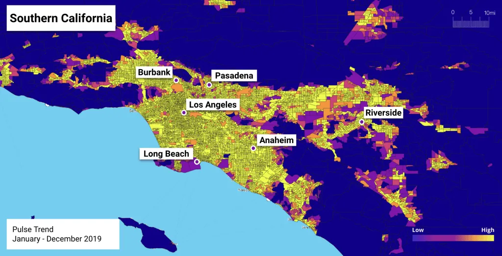
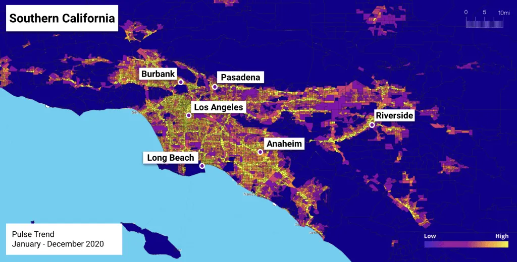
Greater Los Angeles and its surrounding areas (including Orange, Riverside, San Bernardino, and Ventura counties, all shown in the images below) are home to nearly 20 million residents. It’s a densely populated area, and the growth in mobile device density clearly reflects that in this pre-pandemic view from 2019.
In 2020, you can see growth decrease sharply throughout the region. This could be an indicator of urban residents fleeing to less populated areas seeking more space and lower cost of living. It could also reflect the sharp decrease in tourism seen in 2020 as a result of lockdowns and other Covid safety measures.
In 2021, the region started to see mobile activity pick up again, as many started to feel safer in urban areas again thanks to vaccinations. California was among the more highly-vaccinated populations in the U.S., with a reported 83% of California residents getting at least 1 shot by the end of 2021.
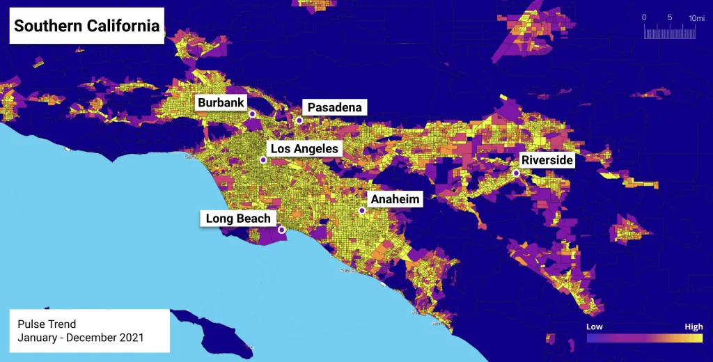
While our top cities had not fully recovered by the end of 2021, the shift towards recovery is visible and significant. As we collectively navigate towards our new normal, human movement data can provide a compass that helps us understand what that looks like.
Interested in learning more? Get a demo or check out our resources page.


